
FULL DOCUMENTATION
0 TO 1
RESPONSIVE DESIGN
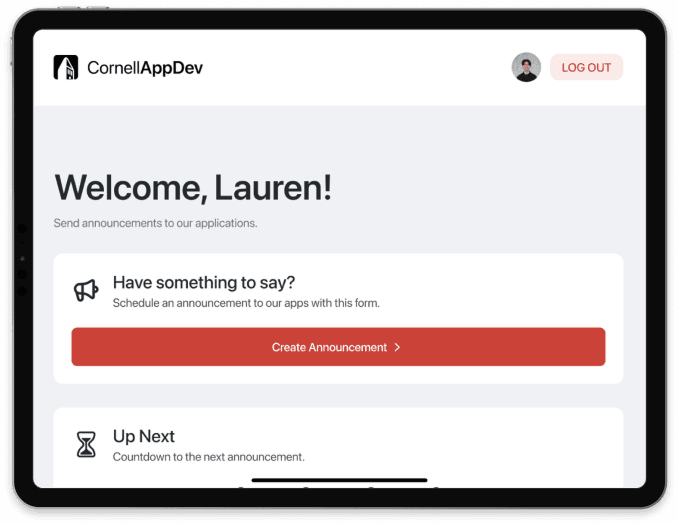
Announcements Web App
Announcements Web App
Announcements Web App
Cornell App Development
Cornell App Development
Cornell App Development
Streamlining marketing blasts and user notifications for downtime, events, and updates.
Streamlining marketing blasts and user notifications for downtime, events, and updates.
Streamlining marketing blasts and user notifications for downtime, events, and updates.
Role
Role
Role
Product Designer
Product Designer
Product Designer
Team
Team
Team
1 Designer, 5 Developers, 1 PM
1 Designer, 5 Developers, 1 PM
1 Designer, 5 Developers, 1 PM
Timeline
Timeline
Timeline
4 months
4 months
4 months
Context & Impact
Context & Impact
Context & Impact
Announcements is Cornell AppDev’s internal web app designed to schedule, send, and manage one-time marketing blasts to 15,000+ MAU across 5+ products.
As the sole designer on the project, I streamlined announcement creation in an interactive, responsive interface accessible on any device, working closely with development throughout the progression of the project.
> PROBLEM
> PROBLEM
> PROBLEM
It's difficult to efficiently notify users about app downtimes, information sessions, and events.
It's difficult to efficiently notify users about app downtimes, information sessions, and events.
It's difficult to efficiently notify users about app downtimes, information sessions, and events.
Previously, we had to directly call the API using Postman to announce.
Previously, we had to directly call the API using Postman to announce.
Absence of a user-friendly interface for creating/managing announcements.
Absence of a user-friendly interface for creating/managing announcements.
We could not preview announcements before they go live on users’ devices.
We could not preview announcements before they go live on users’ devices.

⚠️
HMW
HMW
HMW
Streamline the process of creating announcements into a dynamic and user-friendly interface that allows users with and without a technical background to schedule and preview announcements?
> KEY FEATURES
> KEY FEATURES
> KEY FEATURES
01 Create Announcement
01 Create Announcement
01 Create Announcement
See a preview of the announcement banner live, as you are filling out the necessary information to schedule an announcement.
See a preview of the announcement banner live, as you are filling out the necessary information to schedule an announcement.
See a preview of the announcement banner live, as you are filling out the necessary information to schedule an announcement.

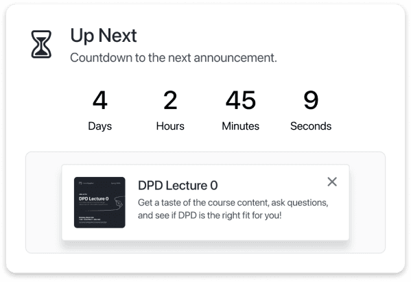
02 Up Next
02 Up Next
02 Up Next
Skim a countdown of what announcement is scheduled to go live next at a quick glance.
Skim a countdown of what announcement is scheduled to go live next at a quick glance.
Skim a countdown of what announcement is scheduled to go live next at a quick glance.
03 Manage Announcements
03 Manage Announcements
03 Manage Announcements
View, edit, and delete active and past announcements.
View, edit, and delete active and past announcements.
View, edit, and delete active and past announcements.

> ORGANIZATION AND LAYOUT
> ORGANIZATION AND LAYOUT
> ORGANIZATION AND LAYOUT
Reducing visual clutter while prioritizing the most necessary information at a glance.
Reducing visual clutter while prioritizing the most necessary information at a glance.
Reducing visual clutter while prioritizing the most necessary information at a glance.
Announcement Card Design
Announcement Card Design
To view the full preview of the announcement, as well as secondary information like who scheduled the announcement, the user can click on the card, which opens a pop up. This pop up also serves as an entry point to editing or deleting an announcement.
To view the full preview of the announcement, as well as secondary information like who scheduled the announcement, the user can click on the card, which opens a pop up. This pop up also serves as an entry point to editing or deleting an announcement.
To view the full preview of the announcement, as well as secondary information like who scheduled the announcement, the user can click on the card, which opens a pop up. This pop up also serves as an entry point to editing or deleting an announcement.

❌ Dynamic Details
❌ Dynamic Details

✅ Static Details
✅ Static Details
> ACCESSIBLE VISUAL HIERARCHY
> ACCESSIBLE VISUAL HIERARCHY
> ACCESSIBLE VISUAL HIERARCHY
Creating quick context and contrast through color and iconography.
Creating quick context and contrast through color and iconography.
Creating quick context and contrast through color and iconography.
Status Indicators
Status Indicators
I designed three different status indicators for the announcement preview popups.
I designed three different status indicators for the announcement preview popups.
I designed three different status indicators for the announcement preview popups.
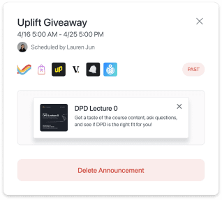
Past Status
Past Status
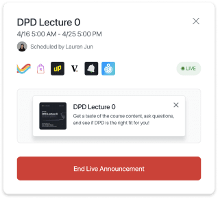
Live Status
Live Status

Upcoming Status
Upcoming Status
For Live, displaying the little circle provides better context to those who are color blind and a more easily understandable message. Additionally, the colors chosen were intentional to ensure that they were digestible and enhance visual hierarchy.
For Live, displaying the little circle provides better context to those who are color blind and a more easily understandable message. Additionally, the colors chosen were intentional to ensure that they were digestible and enhance visual hierarchy.
For Live, displaying the little circle provides better context to those who are color blind and a more easily understandable message. Additionally, the colors chosen were intentional to ensure that they were digestible and enhance visual hierarchy.

Indicator Only
Indicator Only

Indicator and Text
Indicator and Text

Explicit Icons and Text
Explicit Icons and Text
> DELIGHTFUL INTERACTIONS
> DELIGHTFUL INTERACTIONS
> DELIGHTFUL INTERACTIONS
Leveraging actionable CTAs and states for improved user direction.
Leveraging actionable CTAs and states for improved user direction.
Leveraging actionable CTAs and states for improved user direction.
Input Validation
Input Validation
I established requirements for announcement forms, such as title, body, image, and apps. We wanted to be able to provide users with more information about the form as they filled it out. Thus, I built out buttons in our mini design system with multiple states (i.e. Enabled, Hover, Pressed, Loading, Disabled).
I established requirements for announcement forms, such as title, body, image, and apps. We wanted to be able to provide users with more information about the form as they filled it out. Thus, I built out buttons in our mini design system with multiple states (i.e. Enabled, Hover, Pressed, Loading, Disabled).

Create Announcement Form - All Fields Empty
Create Announcement Form - All Fields Empty

Create Announcement Form - All Fields Full
Create Announcement Form - All Fields Full
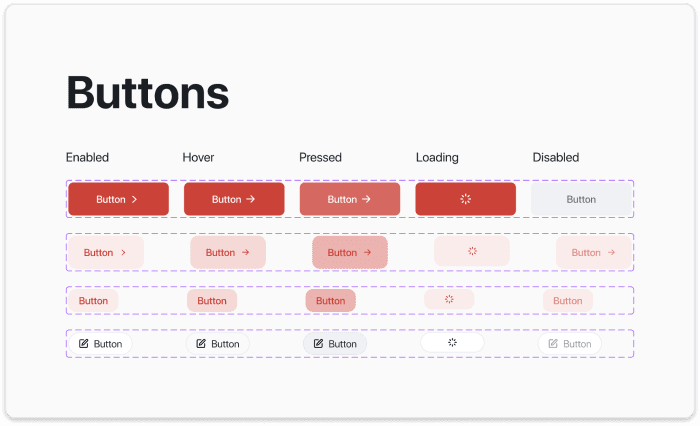
Buttons in Mini Design System - Multiple States
Buttons in Mini Design System - Multiple States
Error States and Feedback Mechanisms
Error States and Feedback Mechanisms
Despite the CTA button being grayed out indicating that it isn’t clickable, warning messages gives an explicit message on why the form cannot be submitted. When the form’s CTA button is clicked without all the necessary fields being filled, the stroke on the missing input turns yellow as a warning and displays an error message.
Despite the CTA button being grayed out indicating that it isn’t clickable, warning messages gives an explicit message on why the form cannot be submitted. When the form’s CTA button is clicked without all the necessary fields being filled, the stroke on the missing input turns yellow as a warning and displays an error message.

Error in Create Announcement Form
Error in Create Announcement Form
> IN-APP VISUALS
> IN-APP VISUALS
> IN-APP VISUALS
Pop Up
Pop Up
This view proves effective in displaying the essential information to the user and providing a link to obtain new information about the feature update, information session, or bug fix being announced.
However, I realized that this announcement view was not as sleek and user-friendly as I had anticipated. The almost-full screen modal hinders the user’s ability to quickly find what they were originally hoping to achieve when they opened the app

Old Announcement View
Old Announcement View
Banner
Banner
The new banner view is overall more efficient, consistent, and user-friendly based on the user’s goals and traditional announcements. The user can still clearly view content when they launch the app. Furthermore, the banner is similar to notifications, which makes clicking or dismissing the announcement more intuitive.
The new banner view is overall more efficient, consistent, and user-friendly based on the user’s goals and traditional announcements. The user can still clearly view content when they launch the app. Furthermore, the banner is similar to notifications, which makes clicking or dismissing the announcement more intuitive.

New - an improved - Announcement View
New - an improved - Announcement View
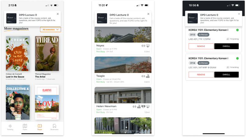
In-App View
In-App View
> PRODUCT OVERVIEW
> PRODUCT OVERVIEW
> PRODUCT OVERVIEW
A Fully Responsive Interface
A Fully Responsive Interface
The redesigned announcement system includes enhanced views and functionalities for handling upcoming, active, and past announcements. Adaptable spacing changes for different screen sizes and devices helps to maintain form and consistency across all versions.
The cards designed for this project change width until they reach a certain breakpoint. On touch screen specifically (i.e. mobile), I considered usability and made the choice to display only one card, which prevents users from having to scroll for a long time.

Desktop
Desktop
Tablet
Tablet

Mobile
Mobile
> REFLECTIONS
> REFLECTIONS
> REFLECTIONS
Things I learned!
Things I learned!
Things I learned!
🌱
This was my first time creating a design system from scratch, but I found that ensuring consistency and accessibility across the platform was incredibly valuable for the user.
This was my first time creating a design system from scratch, but I found that ensuring consistency and accessibility across the platform was incredibly valuable for the user.
⚙️
Working closely with developers was crucial for translating design into a functional product, and iterative design allowed me to refine features based on feedback and usability testing.
Working closely with developers was crucial for translating design into a functional product, and iterative design allowed me to refine features based on feedback and usability testing.
⭐️
Utilizing interaction design is incredibly effective in giving the user more context—and also fun to think about! Considering states is a crucial part of a smooth user experience.
Utilizing interaction design is incredibly effective in giving the user more context—and also fun to think about! Considering states is a crucial part of a smooth user experience.

